I've set up a new page on the site to gather the recordings I've already published in one place and present myself quickly as a musician. I'd been thinking of doing that for a while already, but I figured it'd look a bit ridiculous with only a couple of tunes listed, which is why I put it off until now.
It reads like a CV because that's kind of what it is. I'm doing those recordings mostly for fun, but I'd be lying if I pretended I'm not hoping to find more gigs, and I figure this page might help with that.
It's still pretty barebones, and I'll see if I add more to it in the future. I'd rather avoid making it too busy, as I don't want to bore people who'd just like to check out the tracks. Hopefully keeping the player near the top will be enough.
I hoped the extra menu entry would fit on a mobile screen. Obviously it did not:
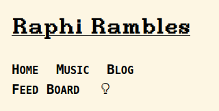
I half-assedly fixed it by reducing the spacing for now, but I'll need a proper solution if I ever add another section. I've never owned a smartphone, and I'm bad enough at CSS that having to care about that sort of things always annoys me, but oh well. Picture grampa Simpsons yelling at the clouds and let's move on.
Most of the real work was on the audio player, which I'll cover in more details in a future note. I'm quite happy with how that one turned out, even if I'm sure the light theme colors will make any decent designer's eyes bleed.
While I was at it, I also added a custom page for 404 errors (basically, the response you get when trying to access a page that doesn't exist), and also tweaked the general layout.
I like having the sidebar on the right side, for some reason, and figured it'd be cool to have the main content expand as soon as it got the place, so that's what I did initially:
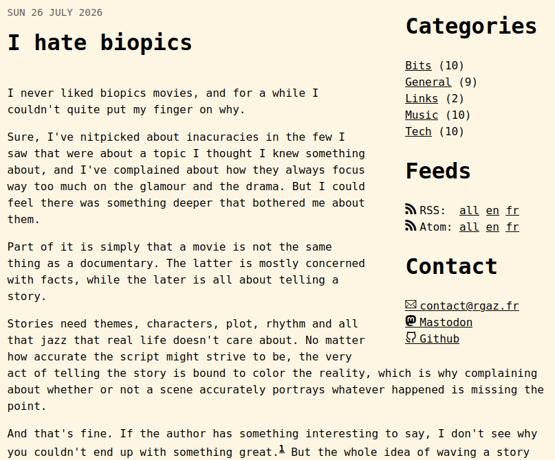
That does look kinda cool, but the problem is that, as far as I know, I have to use float positioning to achieve that effect, which in turns causes all sorts of shenanigans.
I got sick of having to be careful not to include anything that might be large enough to mess up the whole layout too early in a post, so I got rid of it and turned it into a regular sidebar. This means the main content is slightly off-axis, but I don't think it's too big a deal.
The whole thing tok about two days of pretty simple coding, which was short enough for me not to get pissed at javascript. There are still a bunch of things I could keep tweaking, but I can do that when the mood strikes me. For now, the basic plumbing is done.
See ya internets, hopefully I'll have something more interesting to yap about next time.